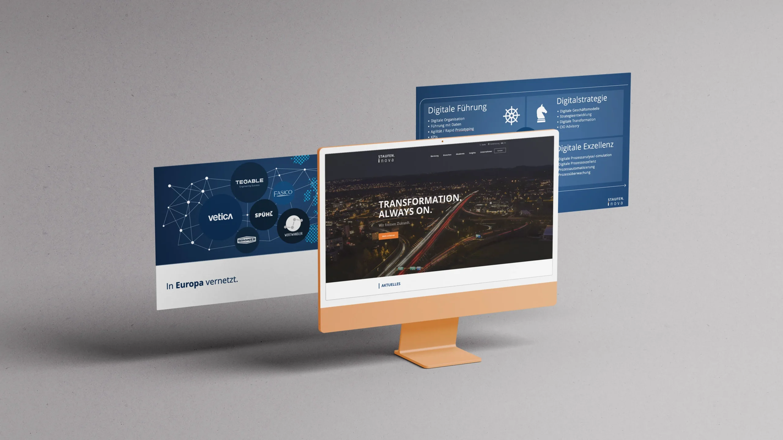

Vetica designed an optimized digital brand identity for the successful consulting company Staufen.Inova.
The partnership between Staufen.Inova and Vetica allowed the teams to work closely together from day 1. The goal was clear: to revise and optimise the design of the current brand identity with the relaunch of the new corporate website. Vetica developed the guidelines for Staufen.Inova’s new colour palette, typography and corporate imagery. This was complemented by the creation of a harmonious image database, renewed icons and the optimisation of the company presentation. Some graphics were also completely reimplemented.
In addition, Vetica orchestrated the management of the textual content in the cloud to enable fast and efficient collaboration between the Stau-fen.Inova team, Vetica and the web developers.
Keyword: optimise!
Thanks to the modular structure of the new website and ready-made templates, new content can be added without much effort or programming knowledge. This makes it easy for Staufen.Inova to manage this new website completely by itself and to put new content online.