The experts in safe and smart mobility
LIWIN MECHATRONIC TECHNOLOGY CO., LTD. was founded in 1981 and is dedicated to the manufacturing and maintenance of various types of elevators.
In order to continue to provide stable LIWIN product quality and improve technology, LIWIN not only invests more in R&D and process technology, but also plans to build elevator test towers in order to continuously improve product intelligence. However, under the pressure in the high- and low-end product market, LIWIN is facing the dilemma of market fragmentation in the mid-range product positioning.
The biggest challenge is maintaining the existing market share and expanding into new overseas markets. Through the Branding Taiwan project of the Industrial Development Bureau of the Ministry of Economic Affairs (MOEA), Vetica was invited to assist with this rebranding project. Vetica’s task was to support LIWIN in restructuring its business model, redefining its brand strategy, establishing a clear brand identity, and conducting brand training so that the brand values would be deeply anchored in every member of LIWIN. With a solid brand foundation, LIWIN can build an international image and expand its market presence.
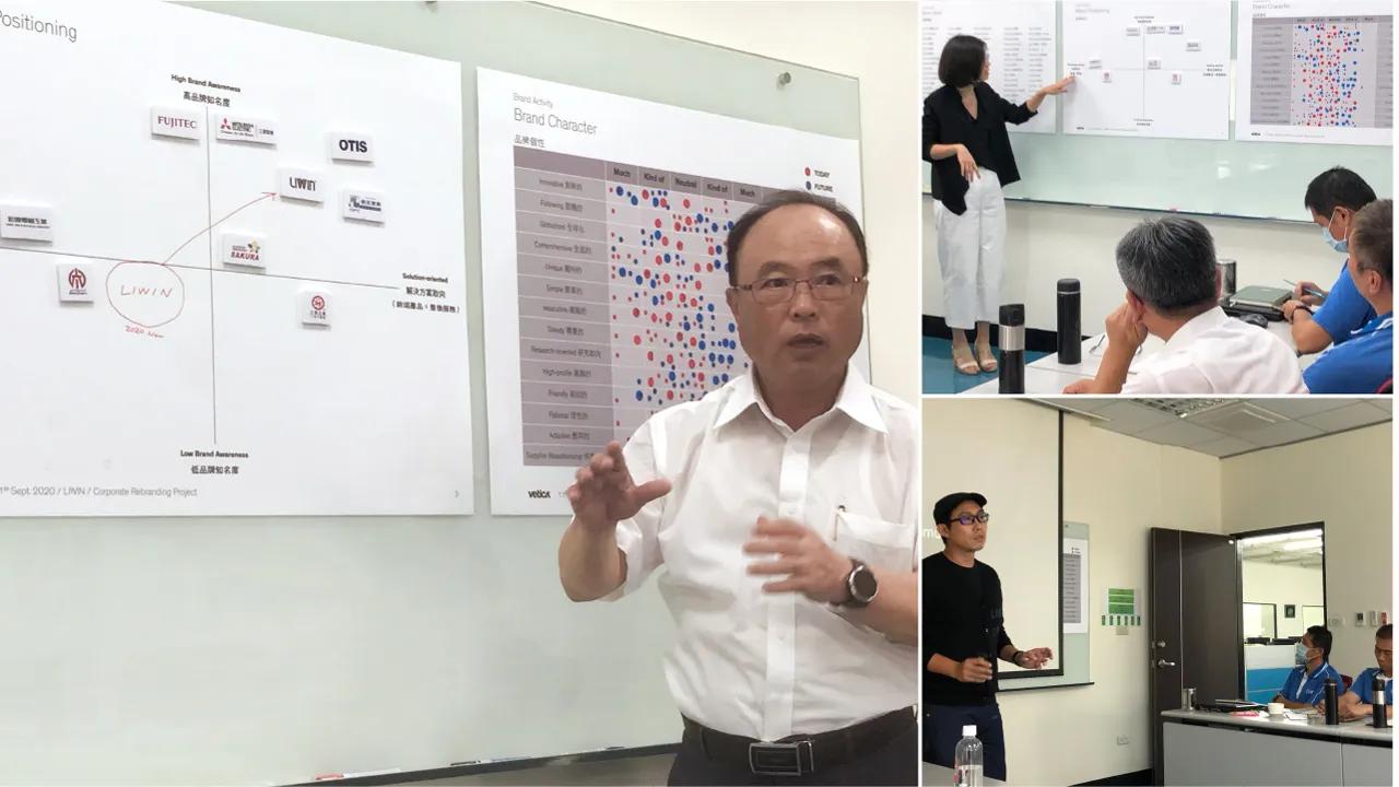


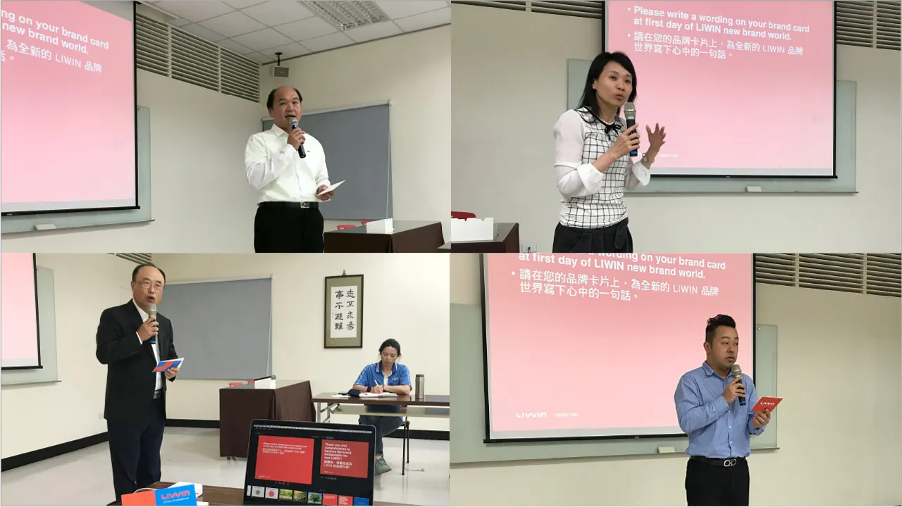
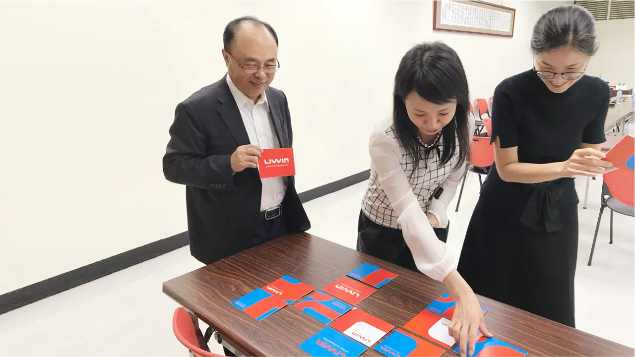
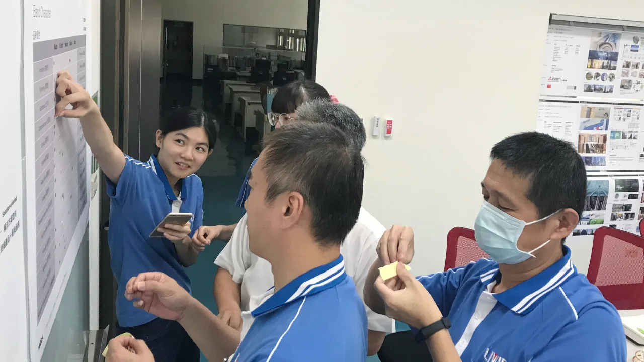
A New Vision for a Better World
Based on the analysis of the existing business structure, Vetica and LIWIN worked together to understand the business model and product positioning. Meanwhile, stakeholder interviews helped to gain insights into customer perception and the external market landscape. Finally, the team defined the brand positioning and value propositions through collaborative brand workshops.
The brand values were redefined to offer “safe” products as the primary objective; to pursue corporate “sustainability” as an essential commitment to customers and society; and to foster service with “passion” as a steadfast attitude. By embracing these brand values, the corporate vision of “Lifting to Connect” is expanded.
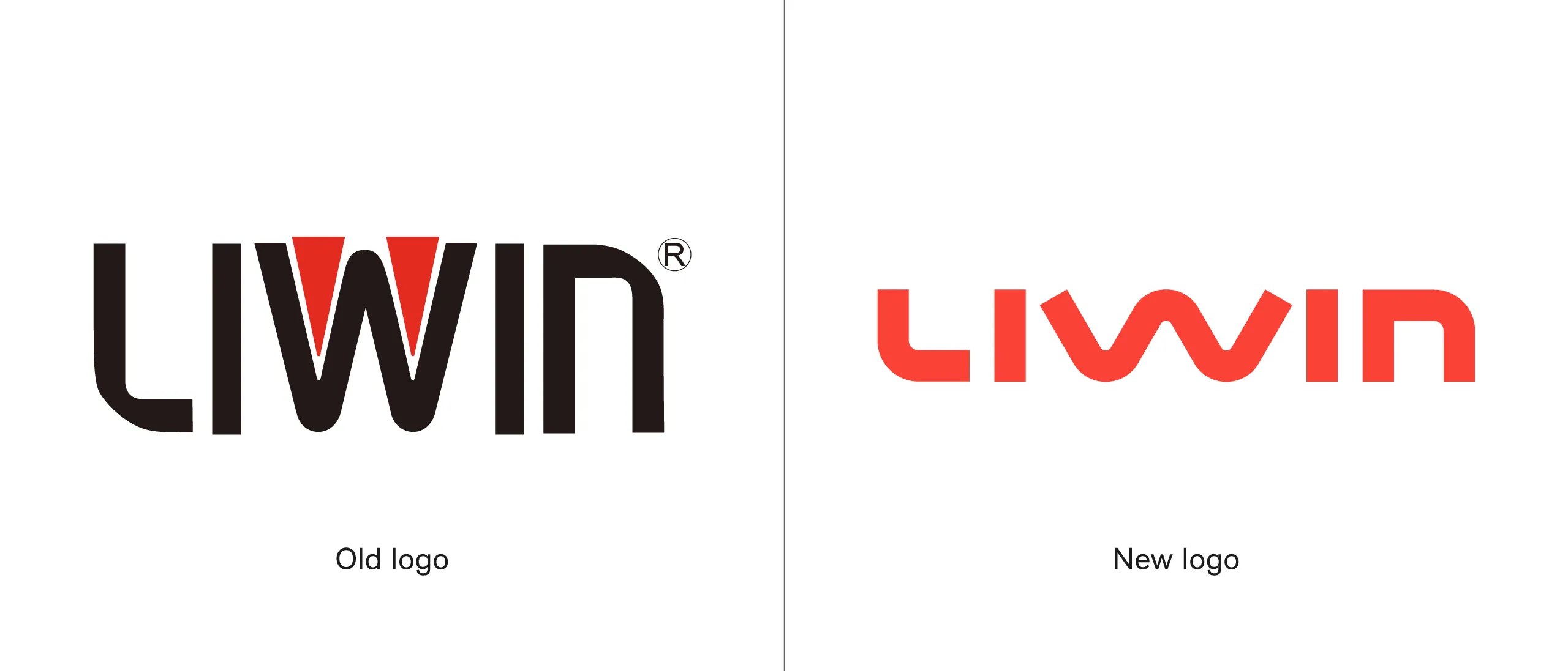

A new identity for balance in performance
Brand value was expanded as the core, extending from verbal and visual strategies to establishing a new brand identity and a complete identification system. Furthermore, the application design for every touchpoint was broadened based on this new system. Finally, the complete identification system was integrated into a brand identity system guideline to effectively implement brand management.
The “Balance in Performance” concept is the starting point for LIWIN’s new identity—a blend of flexibility and persistence. As the foundation, the design focuses on the lines that form the “L” and the “N”. These are both rounded (symbolizing service) and strong (symbolizing safety), representing flexibility and endurance in the company’s evolution. The orange color combines red, which expresses passion, and yellow, which stands for sincerity and friendliness.


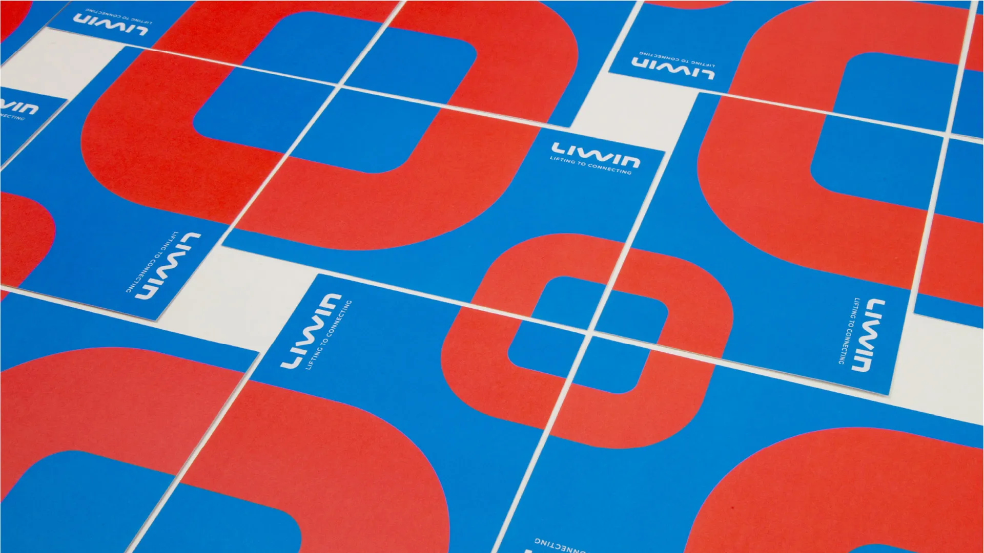
Vetica’s collaboration with LIWIN went beyond merely helping LIWIN establish an international brand image; it also encompassed co-creation and brand training to progressively build consensus and brand identity within the LIWIN team. In this way, the brand spirit can manifest from the inside out to create a long-lasting and sustainable impact.


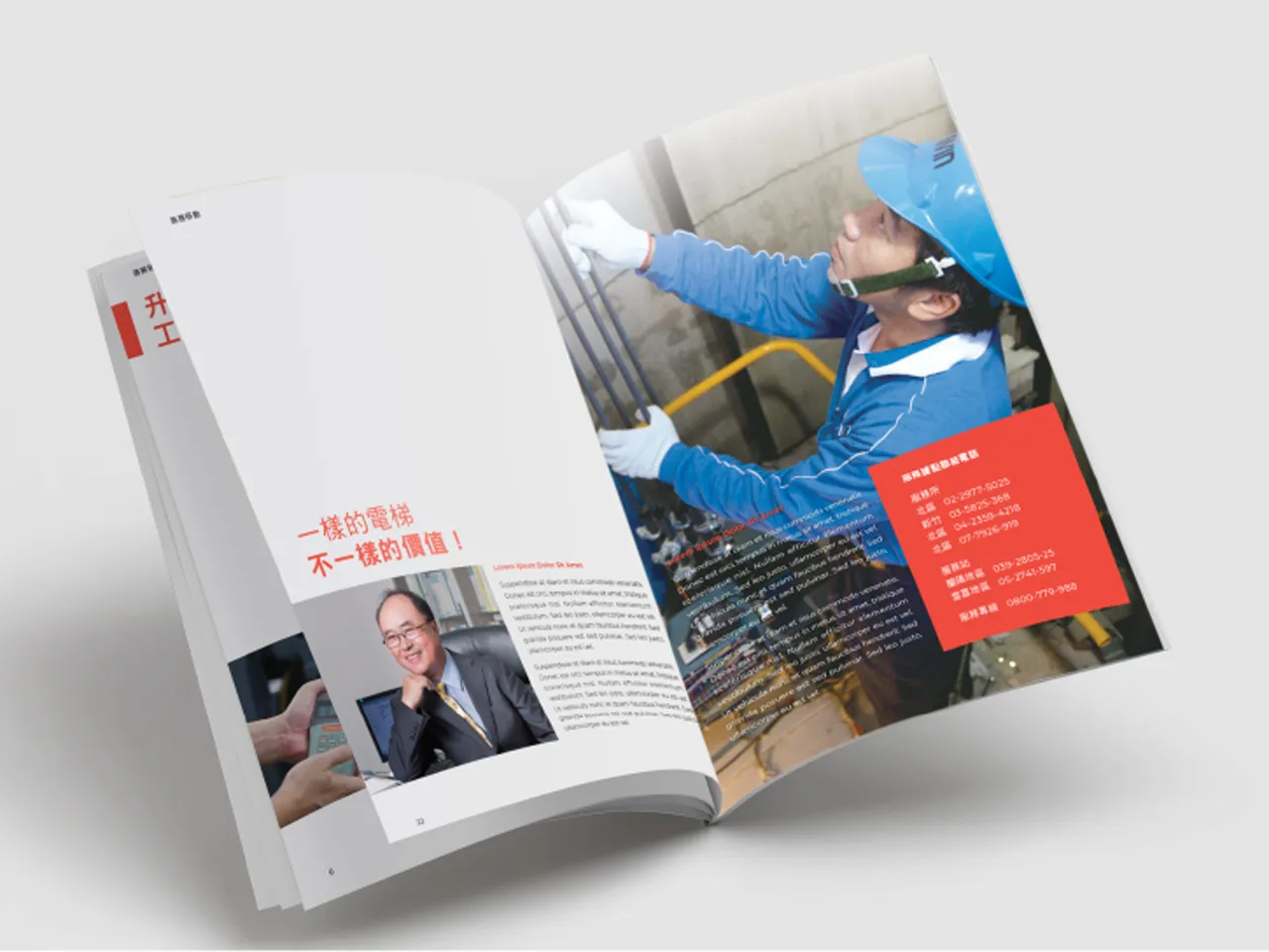


The new branding makes the entire LIWIN experience more modern. That's exactly what we wanted: a more European or American look, international and innovative. It shows the liveliness of the company, matching the sustainable development of LIWIN.
Pei-Chung Lo, Director of LIWIN MECHATRONIC TECHNOLOGY CO., LTD.