ServicesBranding - Strategy - Interaction Design
SectorsMedical
EPED Inc. is a medical equipment provider specializes specialized in minimally invasive solutions. What once began in the dental education business, gradually expanded into the medical sector and confusion between two different markets emerged. This is where Vetica came in. After a restructuring and rebranding, the results led to the business success.
The rebirth of EPED
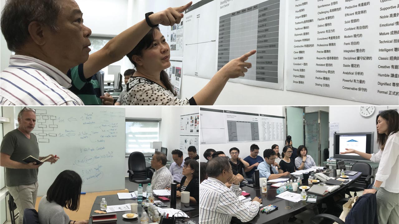
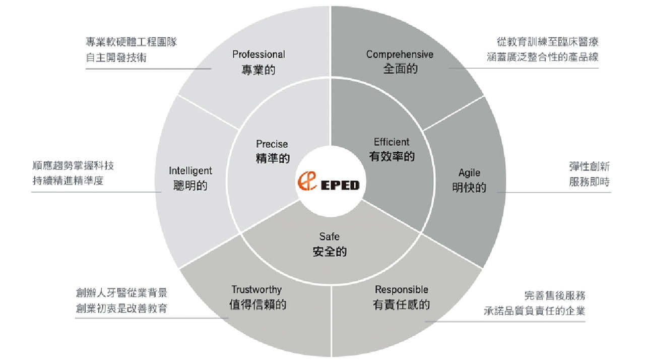
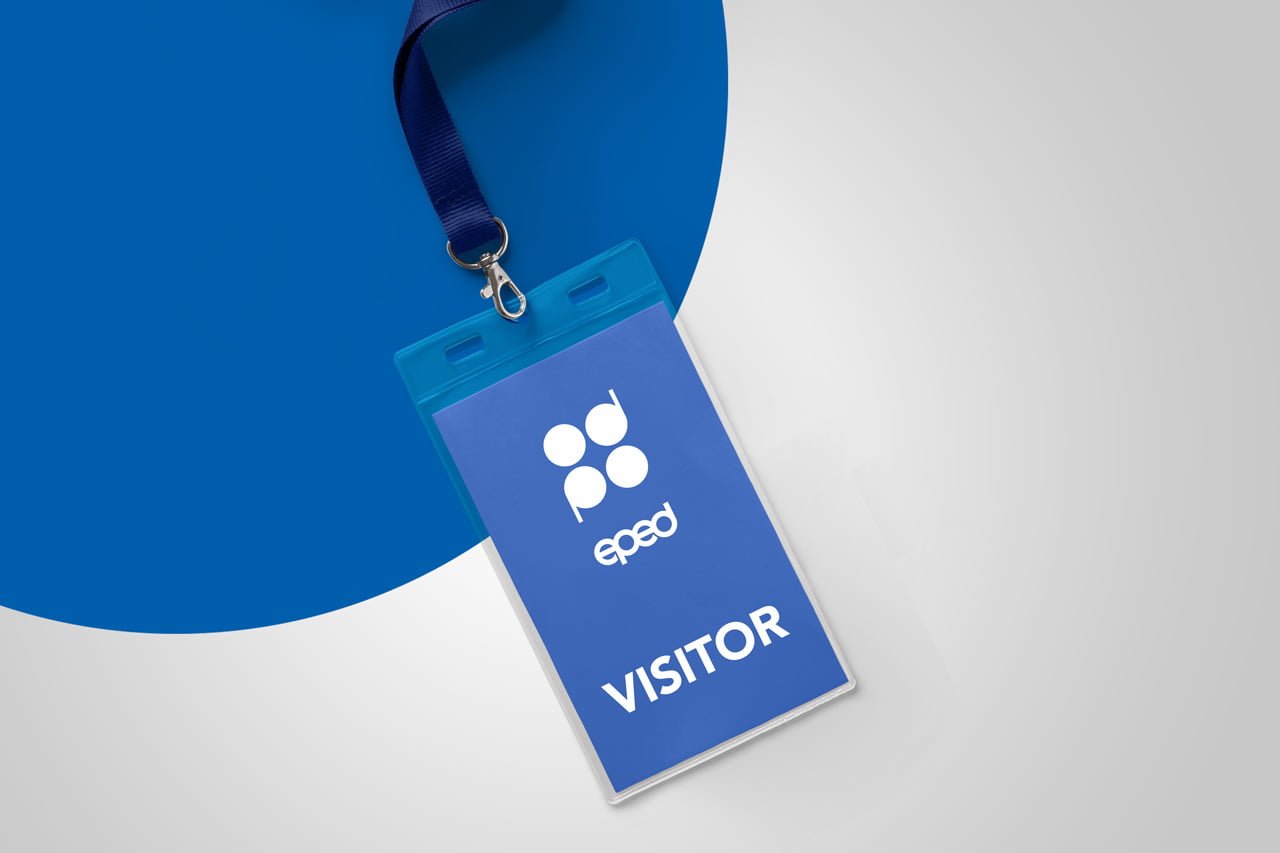
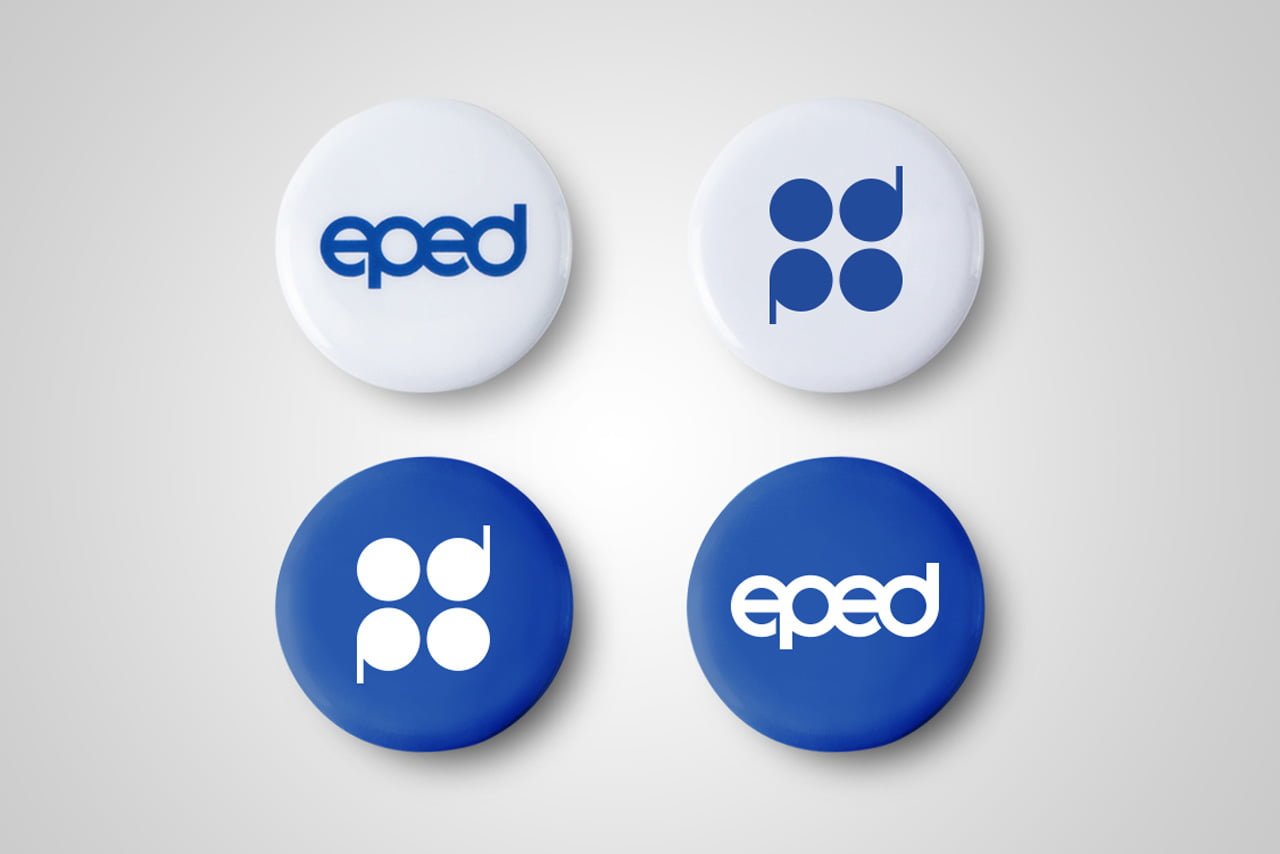
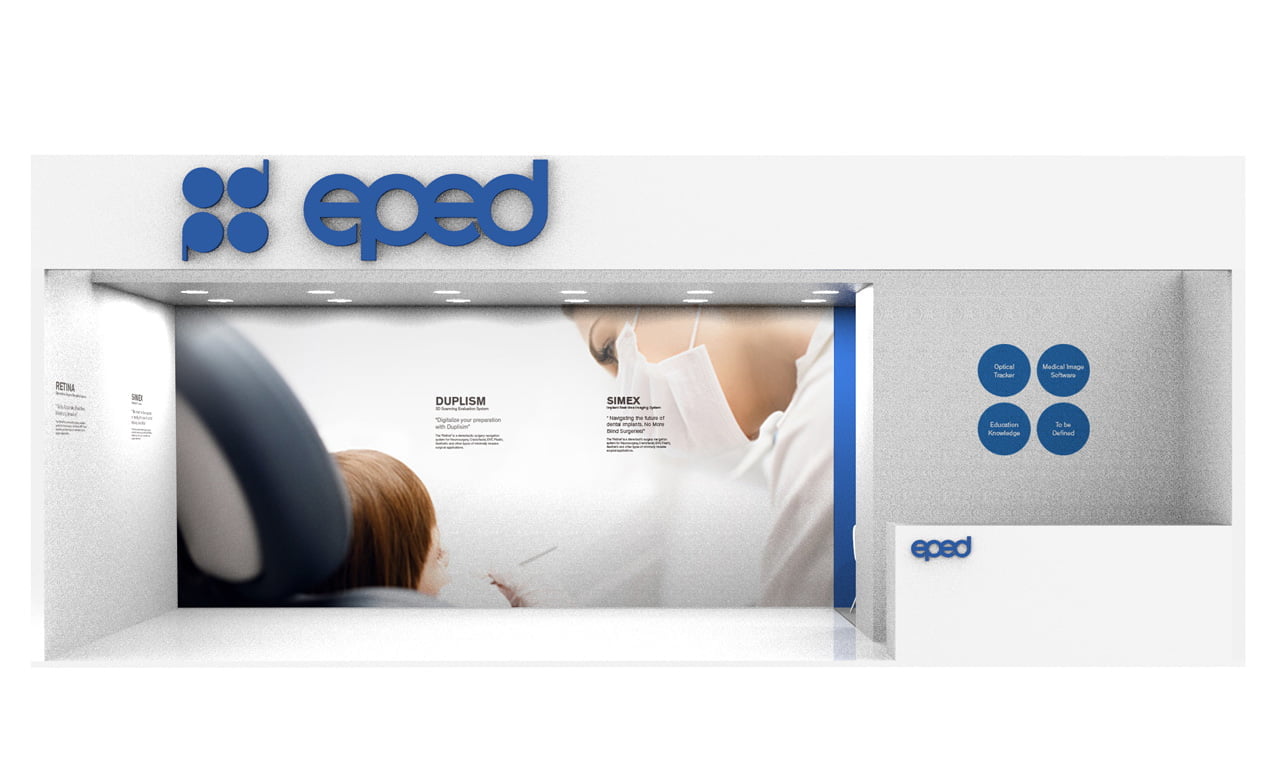
Starting with redefining the brand’s foundation, EPED went through a total transformation within an intense year. The new identity consists of a symbol inspired by the letters e-p-e-d with a rounded typeface, showing the precise, professional and forward-moving nature of the brand.
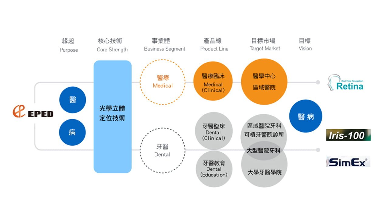
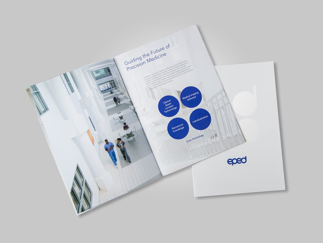
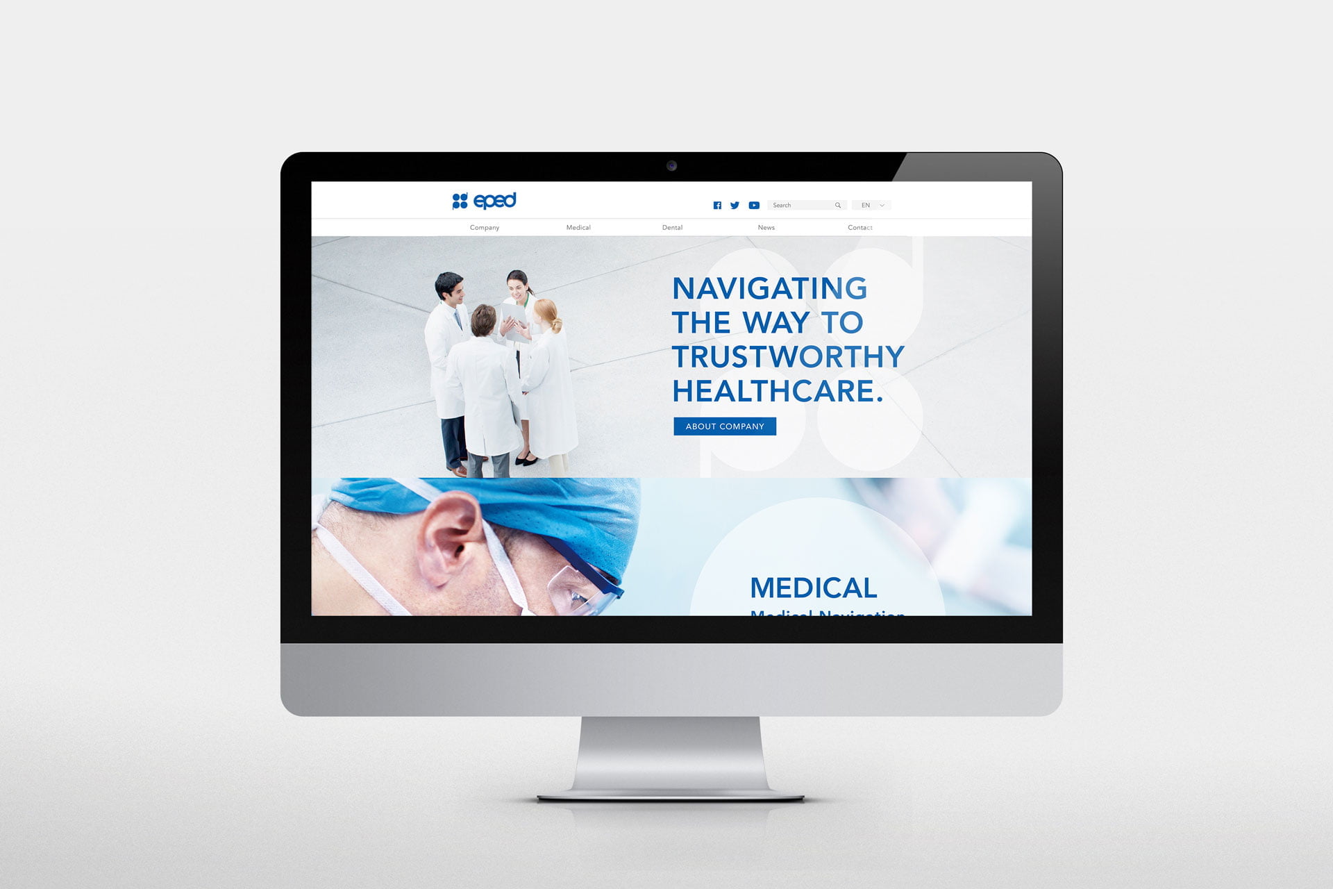
However, thinking strategically for the client comes before redesigning the brand. To keep a clear segmentation and a balance between resources, the EPED brand was elevated to a corporate level with two distinguished business units; Dental and Medical. Given a modernised new look, each unit is designed with different imagery principles and colour systems. As a result, the renewed brand achieves consistency without confusion.
After the relaunch, EPED has received positive market feedback during medical fairs which reflects on sales development. We are proud to be a part of making great Taiwanese brands thrive globally.


“After the brand relaunch, we are now comparable to international brands. New clients are often amazed that we are from Taiwan!”
Douglas Huang, Chairman, EPED Inc.